
What kind of resume design are you using? Will it make a favorable impression? Although most resumes today are sent via electronic mail or created in Microsoft Word or PDF and uploaded to a website.
Submitting a printed resume is still common, particularly when attending in-person teacher job fairs, performing walk-in applications, bringing your resume to your scheduled job interview, or only when distributing it within your network of contacts.
Like with your digital resume, your paper resume needs to make use of the design elements efficiently to make it more visually appealing. With a well-designed resume, you can increase your chances of it being read and getting an interview where you can personally promote yourself to the school you are interested in working.
Basic Tips on Using Practical Resume Design Elements
Above all else, you need to consider the attractiveness of the paper you are planning to use. This will be more like the impression you are setting yourself, so be careful when choosing a paper type for your resume. Most schools today are interested in a more conventional yet highly professional look and style. The paper could have a shade of either white, off-white, or a pale gray shade to keep it professional-looking.
The type of print will play a significant role in determining the overall visual impression of your resume. If at all possible, your resume should be laser printed.
Ideally, your resume must not contain more than two different fonts. The most common and highly recommended typefaces for professional resumes are Arial, Cambria, Calibri, Constantia, Lato, Helvetica, and Verdana are safe and comment. Of course, Times New Roman is safe, but many job seekers use that font. Steer away from a common font like Times New Roman to stand out from the other candidates.
Be consistent with your design and focus on a particular style and stick to it. Always try to conform with font size, capitalization, bold, italics, and other formatting. If you have decided to bold subheadings, discard the italics to give your resume a uniform look and appeal to the eye. Ensure your cover letter complements your resume.
Use open spaces and other attention-grabbing graphics that will not interfere with your resume’s readability and professional look. The particular contrast that happens between a dark print and a clean white space is attention-grabbing, and you should take advantage of this to make your resume more visually appealing while maintaining its professional and business format.
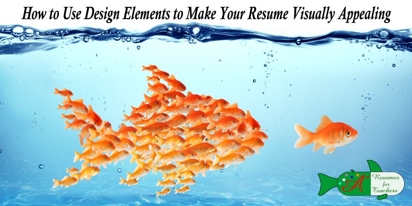
Sometimes, a resume’s visual appearance will determine whether or not a school district will read it or go unnoticed. By learning how to productively use the design elements that can make a resume more visually appealing, you can increase your chance of being hired once you submit your resume.